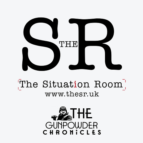
Framing the Forum: The Logos of The Situation Room
Every element of The Situation Room’s design—brackets, signals, transmission lines, sober colours—embodies structure, urgency, and authority, shaping a disciplined arena for urgent democratic debate.
The Logos & Their Meaning
Our logos embody clarity, authority, and accessibility, staying true to the mission of The Situation Room as a space for serious debate, strategy, and insight.
Minimalist Framing Brackets → Clean and sharp, the brackets frame the debate itself, symbolising structure, focus, and boundaries within which dialogue takes place.
Editorial Aesthetic → The typewriter-inspired font roots the project in journalism and editorial rigour, underscoring credibility and accountability.
Subtle Red Accents → Red highlights draw attention to detail and urgency, hinting at the critical nature of issues under discussion.
Large Serif Initials (“SR”) → A bold anchor that signals authority and gravitas, much like the institutions and strategy rooms we reference.
Modern Simplicity → Our logo emphasises permanence, clarity, and directness, reflecting The Situation Room’s role as a space where ideas endure beyond the moment of debate.


The Colour Code
Our palette is intentionally sober, authoritative, and modern:
Background #f5f6f7 → Light, neutral clarity. Like briefing paper, it represents facts and transparency.
Accent #5a646e (Steel Gray) → Authority, seriousness, discipline, an echo of intelligence chambers and strategy boards.
Red Highlights #B11226 (Main-Red) → Urgency, conflict, warning—marking the moments where debate sharpens into confrontation.
This system ensures The Situation Room looks and feels like what it is: not a talk show, but a disciplined arena for testing urgent ideas about the future of democracy, security, and peace.
